Why Empty Space Is Not Wasted Space in Photography
When you hear the term negative space, what comes to mind?
In photography, negative space refers to the areas around your subject that are considered empty or less visually busy. At first glance, it might seem like space that is being wasted because it does not contain the main subject of the photo. In reality, that empty space is often doing some very important work.
Negative space helps isolate your subject and makes it obvious where the photographer wants the viewer to look. Without distractions pulling your attention elsewhere, the main subject becomes stronger simply because it has room to stand out. Many photographers think of negative space as breathing room for the image. It gives the eye a chance to rest and helps the photo feel less cluttered.
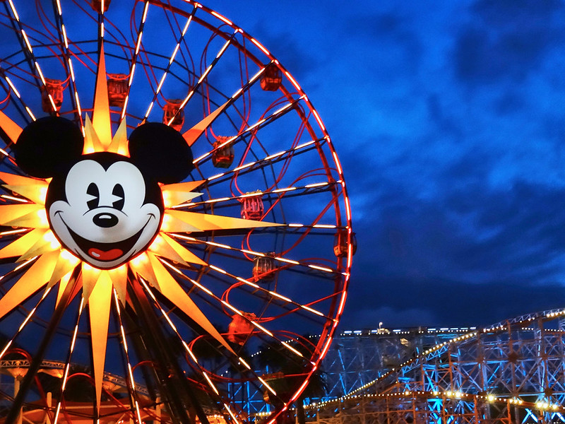
One of my favorite examples of this is the accompanying photo of Pixar Pal-A-Round at Disney California Adventure. Most people photographing the wheel would instinctively try to fit the entire attraction neatly inside the frame. Instead, I chose to let the left side of the wheel extend beyond the edge of the image while leaving a large portion of the deep blue evening sky visible on the right side.
That choice changes the feeling of the image completely.
The glowing lights of the wheel stand out more dramatically against the darker sky because there is room for them to breathe. The open space also creates a sense of curiosity. The viewer naturally wonders why part of the wheel was cut off instead of fully included. That small question encourages people to spend a little more time looking at the image while their brain works through the composition.
That extra attention is valuable.
One of the interesting things about photography is that sometimes what you leave out of the frame can be just as important as what you include.
Negative space can also help communicate mood. In theme park photography especially, the empty areas of a frame can emphasize scale, atmosphere, or even emotion. A large open sky during blue hour can make an attraction feel grand and cinematic. Empty water reflections around a structure can make a scene feel peaceful. Even fog, darkness, or shadows can act as negative space when used thoughtfully.
Another reason I love photographing with negative space in mind is that these kinds of images are incredibly versatile. They work beautifully for title cards, video thumbnails, postcards, greeting cards, and photo book covers because they leave room for text. If you look closely at magazine covers, advertisements, and travel brochures, you will notice photographers intentionally compose images with open areas specifically so designers have room to place headlines and graphics without covering the subject.
I used this particular photo as the cover image for one of my annual photo books. The open sky gave the perfect location to place the title without competing against the ferris wheel itself.
When I photograph a subject, especially in a theme park, I rarely stop after taking the obvious shot. Usually I will start by capturing a more traditional composition where the attraction fills the frame. Then I begin experimenting with ways to make the image feel different from what most people would expect. Finally, I look for opportunities to intentionally include negative space so I have creative flexibility later.
That flexibility matters more than people realize.
It is always easier to crop into an image later than it is to magically create more space around your subject after the fact. Modern editing tools and generative AI can attempt to expand a frame, but at the end of the day the computer is only guessing what might have existed outside the edges of your photo. It is never quite the same as capturing the real scene in camera.
Theme parks are especially fun places to experiment with negative space because they offer so many opportunities to play with scale, lighting, and atmosphere. Wide skies above castles, reflections on water, glowing attraction lights against the night sky, or even long empty pathways early in the morning can all become tools for composition.
Blue hour is one of my favorite times to look for these opportunities. The sky still holds rich color while the lights throughout the park begin to glow. That contrast between the illuminated subject and the darker surrounding space can create incredibly striking images.
The next time you are in a theme park, challenge yourself not to immediately center every subject perfectly in the frame. Try giving your subject room to breathe. Experiment with placing it off to one side. Leave space for the sky. Let darkness or open areas become part of the composition instead of something you are trying to avoid.
You may find that the empty parts of your photo end up becoming one of the most important parts of the story.
And if you create a photo using negative space that you are proud of, I would love to see it. Come join the Fairy Tale Photo Academy community on Skool and share your favorite examples of negative space photography. It is a great place to learn from other photographers and discover creative new ways to tell stories through your images.
